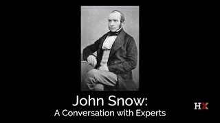
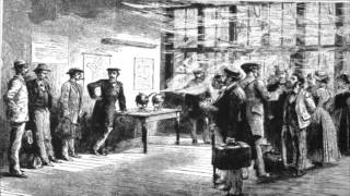
John Snow’s famous Broad Street cholera map, often credited with pinpointing the source of the disease, was actually created five years after his conclusions were published. Contrary to popular belief, the map did not lead to Snow’s discovery of cholera’s transmission method. Instead, Snow reached his conclusions through a comprehensive analysis of patient symptoms, water usage, and the municipal water supply’s condition. He examined the sensory qualities of water, including its smell, taste, clarity, and residue left upon drying. By systematically gathering and analyzing this data, Snow formulated and supported his hypothesis, gradually unveiling the truth about cholera’s spread. The map, therefore, played no role in the discovery, decline of the disease, or the decision to remove the Broad Street pump.
ᴘᴏᴋᴀᴛᴇᴏ ᴍᴀᴘs
@pokateo_maps
·
Apr 7 The truth about John Snow’s map is that it came out well AFTER he had determined the source of cholera. The map was made later to COMMUNICATE information rather than a spatial analysis to aid his discovery.
Anwar Haq
@anwartheravian
·
Jun 4 The Map That Stopped Death: How one doctor’s obsession with data saved an entire city.
London, 1854. A deadly cholera outbreak sweeps the city. Hundreds fall. Fear and wild rumors spread—bad air, curses, fate. No one has answers.
To provide the best experiences, we use technologies like cookies to store and/or access device information. Consenting to these technologies will allow us to process data such as browsing behavior or unique IDs on this site. Not consenting or withdrawing consent, may adversely affect certain features and functions.
Functional
Always active
The technical storage or access is strictly necessary for the legitimate purpose of enabling the use of a specific service explicitly requested by the subscriber or user, or for the sole purpose of carrying out the transmission of a communication over an electronic communications network.
Preferences
The technical storage or access is necessary for the legitimate purpose of storing preferences that are not requested by the subscriber or user.
Statistics
The technical storage or access that is used exclusively for statistical purposes.The technical storage or access that is used exclusively for anonymous statistical purposes. Without a subpoena, voluntary compliance on the part of your Internet Service Provider, or additional records from a third party, information stored or retrieved for this purpose alone cannot usually be used to identify you.
Marketing
The technical storage or access is required to create user profiles to send advertising, or to track the user on a website or across several websites for similar marketing purposes.